I have a fun technique to share with you today on how to add depth to your cuts! I’ve had many people ask for tutorials on how to use their Copic markers and I wanted to show you a couple of things you can do with them.
I used one of my favorite cartridges, Animal Kingdom, to cut this cute lion. He looks pretty good as is…..but a little flat.
For the lion’s body I used these markers. If you don’t have these exact colors that okay. What I generally recommend is 3 colors. A light, a medium, and dark in the same color family. So my light color is E53, my medium color is E31, and my dark color is E33. My Y26 I used as a contrasting color, but isn’t necessary.
Let’s start with our dark color first
When coloring an image I usually start with my darkest marker. I create a sort of outline around the area I want to color.
Next comes my medium color, I am going to “drag” the darker color towards the center with a swiping motion. I also like to think about where shadows would be. On this lion his belly would be darker as well as his legs. I went back over those areas with the darker marker a couple of times to create those shadows.
I then take my lightest marker and again, “drag” the two darker colors in towards the center with the same swiping motion.
The nice thing about Copic Markers is you can rework the areas over and over until you get the desired effect. You are able to do this because they are alcohol based markers.
Now, I could have left the lion’s body alone, but I wanted to show you another fun technique to add texture. You will need an old wash rag, Colorless blending solution, and a Copic Marker.
Simply squeeze a bit of the Colorless blender on the wash rag.
Then swipe the Copic marker where you placed the Colorless blender. You have to work fairly quickly because it will dry pretty quickly.
Then dab your paper with the washrag.
It gives the lion’s body texture to almost resemble fur. I’ve used this technique on grass, and just recently created a Halloween project with a tombstone and did this on grey paper to look a bit like stone.
I still need to finish the lion’s face, so I will use these markers……
I added a bit of pink to his ears and cheeks first, then went over it with my browns. I also used the washrag technique so he matched his body.
I am still not done because I have his mane to color. Remember before? It was just a flat yellow piece of paper?
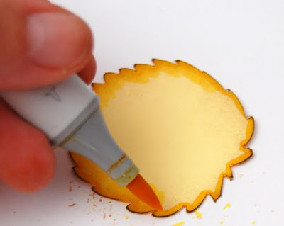
I am doing the same technique as before. I outlined the mane in my darkest color, Y19.
I took Y15 which is my medium color and dragged the darker color in towards the center with that same swiping motion.
I wanted the outside edges to be a bit darker so I went over it again with Y19. I sometimes rework the image quite a few times before I am satisfied with it.
Again, I used Y15 to drag that darker color.
Remember my “flat” lion?
Well, here he is with his makeover! : )
I added a little tag to his tail using the Sentimental’s cartridge. : )
I hope I’ve given you a few tricks on how to use your Copic markers to add depth to your next project! If you have any questions please feel free to ask!
I will have another project later in the week using Copics and Die cuts.
Have a great day my friends!!


11 comments:
Absolutely brilliant--you made him look so lifelike! I hope all the Cricut MB ladies check this out--it is a wonderful tutorial!
Your lion is so sweet! What kind of cardstock do you use for your Cricut cuts? I've used Copics on my Cricut cuts before, and if the color is just a darker shade of the paper sometimes the ink just soaks right into the paper and disappears.
Thanks so much for this tutorial.
I love the pop your lion has when the colouring is completed.
The wash rag trip is awesome. I will use it for my house mouse stamps as well.
Thanks again.
A Canadian follower
This is great since I love my Cricut machine and cartridges.
What a great technique! I'm going to have to give it a try. Thanks for sharing.
Excellent tutorial - it must have taken you ages to photograph, edit and upload. I just wanted to let you know how much I appreciate not only your expertise, but the fact that you share so generously. Thank you!
your lion looks great, as does your tutorial! I was wondering what did you use to make his nose shiny and black?
your lion looks great, as does your tutorial! I was wondering what did you use to make his nose shiny and black?
For the lion's nose I used glossy accents. :)
Awesome! Awesome! Awesome! I'm so gonna try this! Love the card and the depth the coloring gave to the image is really cute!!
TFS,
Susie
Really like the washrag effect and the Copics add so much to the cut ~Thanks!
Post a Comment